Open the alarms overview report
Sign in to Spotlight Cloud at https://app.spotlightcloud.io and click the Reports tab.

The Reports tab is only available for Spotlight Cloud Professional and Trial Professional Subscription holders. The Reports tab will not be visible to you if you have a Spotlight Cloud Basic subscription.
Dates and times
In the report, the Data collected at time indicates the most recent time in the report period that data was collected. This report has no information after this date and time. All times are in UTC time.
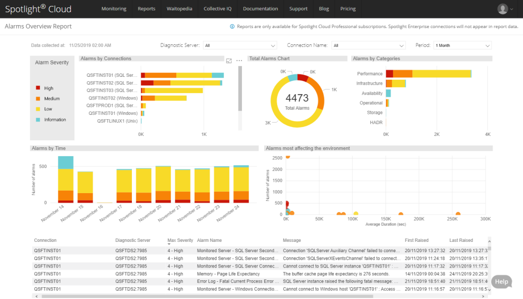
The Diagnostic Servers, connections and period
Select the Diagnostic Servers, connections and period to cover in the report from the drop down menus at the top of the chart. By default the report covers all Spotlight Cloud Diagnostic Servers and all connections monitored through all Spotlight Cloud Diagnostic Servers, over the last month. All reported times and selectable times are in UTC time.
Click on chart axis values to further filter the report display. For example, click on the name of a connection on the Alarms by connections chart to filter the report to show only that connection. Click on a severity bar to filter the report to show only alarm occurrences of that severity. Use the CTRL key to filter on multiple selected items. To remove the filter on a selected item, click again on the item or click an any chart away from selectable items.
Alarm severity
The charts in this report are colored according to the severity of the alarms raised.
| Color | Severity | Description |
|---|---|---|
| High | The alarm occurrence was of high severity. | |
| Medium | The alarm occurrence was of medium severity. | |
| Low | The alarm occurrence was of low severity | |
| Information | An occurrence of an information alarm was raised. |
Alarms by connections
The horizontal bar chart shows the number of alarm occurrences raised against each connection in the report period. The connections are ordered by the number of alarms raised against them.
Each bar is colored according to the severity of alarms raised. This provides a visual indication of the proportion of alarms raised of each severity.
If the connection name is long and therefore partially hidden on the chart you can hover the mouse over the connection name for a full view of the connection name and type.
Hover the mouse over the bars to see the number of alarm occurrences raised of each severity.
Total alarms
The donut chart shows the total number of alarm occurrences raised in the report period across all connections. The donut is proportionately colored according to the severity of each alarm occurrence.
Alarms in each category
The horizontal bar chart shows the total number of alarms raised in each category. The categories are:
- Availability
- HADR
- Infrastructure
- Operational
- Performance
- Storage
Each bar is colored according to the severity of alarms raised. This provides a visual indication of the proportion of alarm occurrences of each severity raised in each category. Hover the mouse over the bars to see the number of alarm occurrences of each severity raised.
Alarms over time
The vertical bar chart shows the number of alarm occurrences raised at successive intervals of time. The time intervals and period of time covered by the chart adjusts according to the selected report period. All times are in UTC time.
Click on a date on the horizontal axis to filter the report according to the selected date.
Alarms most affecting the environment
This chart plots the number of occurrences of each alarm raised in your environment against average alarm duration over the report period. Your environment is made up of the connections and Diagnostic Servers selected for this report.
Each dot represents an alarm. The color of the dot identifies the highest severity at which the alarm was raised over the report period. Hover your mouse over the dot to see the name of the alarm, the number of times the alarm was raised during the report period and the average duration.
Alarms or dots in the top right corner have been raised the most frequently and on average for the longest duration. Alarms in the bottom left corner have been raised less frequently and on average for a shorter duration. Alarms in the bottom right corner have been raised less frequently and on average for the longest duration. Alarms in the top left corner have been raised the most frequently and on average for a shorter duration.
Table of alarms
Lists the alarms raised against each connection in the report period. All times are in UTC time.
| Column | Description |
|---|---|
| Diagnostic Server / Connection | The Spotlight connection monitored via this Spotlight Cloud Diagnostic Server. Expand to show alarms raised. |
| Max severity | The highest severity at which an alarm (the alarm) was raised in the report period. |
| First raised | The first time an alarm (the alarm) was raised in the report period. |
| Last raised | The most recent time an alarm (the alarm) was raised in the report period. |
| Occurrences | The number of times an alarm (the alarm) was raised in the report period. |
| Avg duration (sec) | The average alarm duration during the report period. This is reported in seconds. |
| Max duration (sec) | The longest time an alarm (the alarm) was raised in the report period. |
| Individual alarms | The number of types of alarms raised in the report period. |
Right click on a connection to drill through further. See connection view report or alarm details report.